
Work that starts from a design problem.
Each project below is documented the same way: the problem we were handed, the interface decisions we made, and what the result felt like to use.
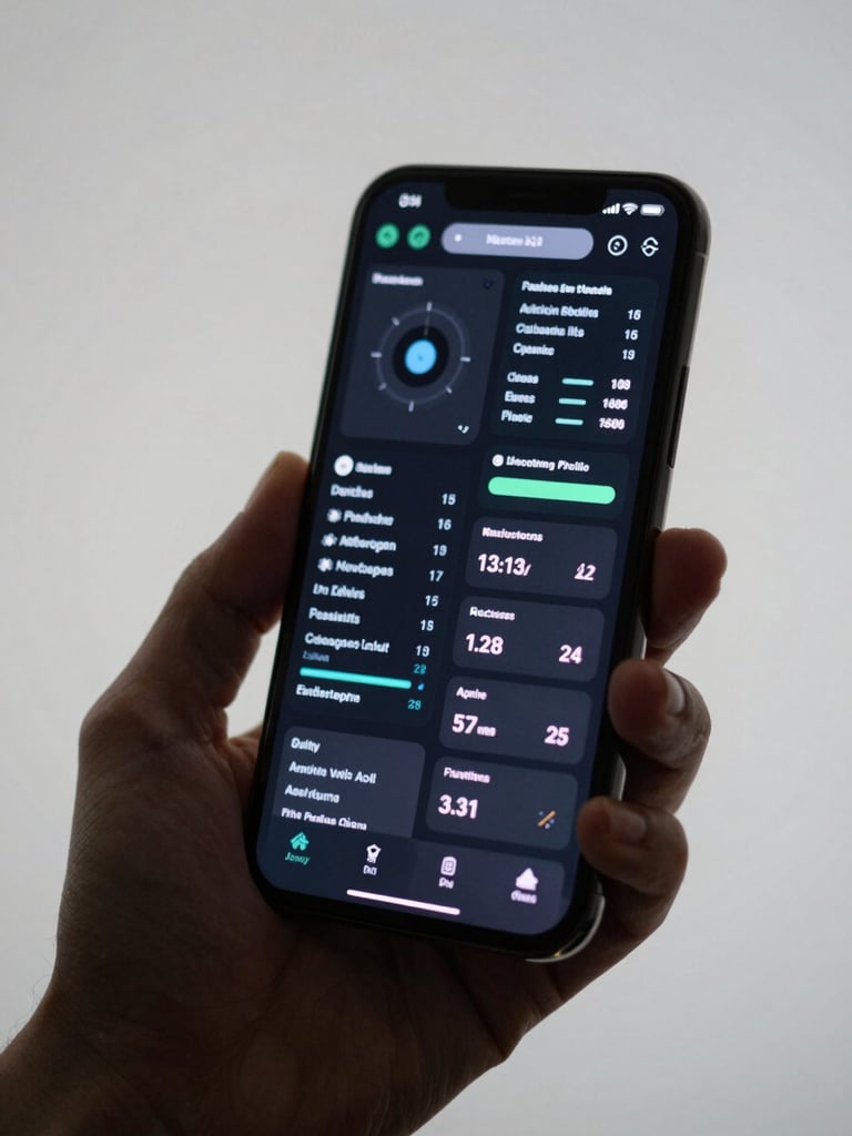
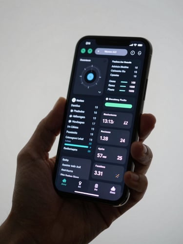
Dense data made obvious.
The client had seventeen data points per record and a field team that couldn't afford to pause. We stripped the interface to the six that mattered in context, surfacing the rest on demand.
Result: task completion time dropped by a third, and support requests about the app stopped entirely within two weeks of launch.

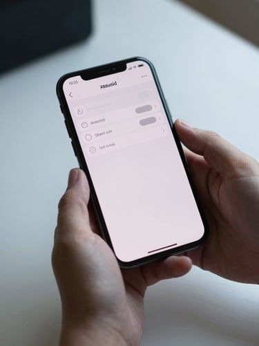
Clarity inside a regulated product.
Compliance requirements forced eleven mandatory fields into a single onboarding flow. We restructured the sequence so each screen carried one decision, not a form.
Onboarding completion rate reached 84%. No tutorial. No tooltip overlays. The flow explained itself.
Every decision before the first line of code.
If these projects look like the kind of work your product needs, let's talk about what we'd build together.